Wednesday, 20 March 2013

Reseach- style guides

This was a rare opportunity to see first hand style guides and publications for systems. The one that I have been most inspired by is the RAC styleguide book produced by Rupert Bassett (and other designers). A style guide is a new concept to me, I love the idea that a whole system of design is located in one source. Also, the object that is describing the system becomes a piece of design in itself which is such a fascinating concept. I think that a styleguide like the RAC book is very over the top and rather self indulgent but it is a fantastic object and it would inspire the designer using the system to want to create the design.


The RAC book utalises a fairly complex grid system of 32 modules. This allows for a great variety of layout possibilities. I love the way every single page has been carefully considered in its construction so that a visually appealing asymmetric layout is created. Above the colour scheme is outlined. I also like the detail and thoroughness of the document. I want to create a style guide for my Typography Workshop design system and I think that if I am to do it convincingly and with conviction then it needs to be with the same thoroughness and attention to detail. Type is fairly small and fits into one column width. Therefore, the designer has more more flexibility in layout possibility. The type is positioned in the top row of modules. 


The book goes into great detail about text positioning, leading, type sizes, alignment  grid sizes, module and gutter sizes, the typeface used, colour schemes, every single element of design has been considered and explained in a clear and precise way. 


The grids are extremely complex devises, particularly when you start illustrating the baseline grid on the columns and rows. However, the very clever way that the grid is conveyed breaks down the information and it is not only simple to follow and clearly explained, it is also visually a nice object. This is a difficult challenge but it is something that I want to explore with my Typography Workshop style guide design. 


There is also sections in the RAC style guide of examples of finalized literature so that the viewer can see what the layout looks like as a finished design. Every single element on each page works with the grid system that has been constructed. Before I create a styleguide, I need to develop a system that works consistently across different formats. Only when I have a finalised set of literature designed can I think about explaining the system through a style guide. 


This poster is another example of a style guide, this time produced by Otl Aicher for the 1962 Munich olympics. This is a very rare object and it was great to see it in real life. It is a seven coloured screen print. I think that it is stunning in design and layout. It is a perfect example of a beautifully designed system that works consistently across all media and platforms. The final poster is so beautiful in design and utalises a fairly complex grid system. Each stage is clearly explained and the order of reading is top to bottom. Colour scheme, typography, the grid system, poster design, logo design, symbols and other formats of design are all explained in one poster. Perhaps this is a way that I could approach my Typography Workshop style guide? Perhaps I could design it so that all of the information is on one poster. 

Tuesday, 19 March 2013

Further research Muller Brockmann Grid systems

In preparation for this project, I have also thoroughly read Grid Systems by Josef Muller Brockmann. He was a Swiss graphic designer and teacher and was notably recognized for his masterful use of typography where he developed grid systems and ways of working which allowed for clean, strong asymmetric layout. I think that it is very important for me to thoroughly research grids and type layout before I start designing for this project because I need to know the fundamental basics before I can develop my own grid system.
The grid systems book is rather extensive, I am going to highlight certain points that I think are most valuable  Its incredible that a book published in 1968 about layout and grid systems has not dated and is still used as a fundamental source of reference for designers today.

Please note- these are not my own ideas but the ideas of Muller Brockmann.

He starts with suggesting that designers should use the standardized din system. This is because the papers are always stocked by manufacturers and you also minimize waste and so increase production costs. "A firm wishing to have corporate identity will also have to introduce uniform paper sizes, for information printed on standard paper makes a great impact on the reader". I will use the din system in my literature for the TW.
The typographic measuring system is the point. There are 798 points to every 30 cm. The type height (height to paper) of 62 2/3 poitns was fixed in 1898. Now, typesetting can be stated in mm and inches and not just points. I think that to aid the simplicity of my explanation of my system that I am going to create, because paper sizes work on millimeter sizes then I should consider explaining typesetting with millimeters also.
Brockmann suggest that column width should be determined by how easily the eye reads the information at a distance of 30-35 cm (if the material is held to be viewed). A well known rule by typographers is that as a set standard, seven words per line is a comfortable amount to read. The leading also effects how easily the type is read, a more heavily leaded type creates a light and open feel.
Kerning also needs to be considered, spacing between letters must be consistant throughout so that the text is easier on the eye. Particularly long lines of text become tiring on the eye, and short ones do too.
Naturally, the width of the column is determined by type size.


Large type will not look right if the margins of the document are too small. If the type is too close to the edge of the page then it will distrupt the overall balanced feel of the design. 

The eye struggles to focus on lines of text where the leading value is too small and so the type is set with too narrow gap between each line. If the gap is too wide then there is also a struggle to read the information as the eye finds it difficult to link each line of information. 
"when the reading is smooth and easy, the meaning of the content of the words is grasped more clearly; they acquire more character and expression and etch themselves more sharply on the mind."

When there is more than one type face used, careful attention should be placed on adjusting the leading so that they work with one another. They should compliment each other. 

A document with a correct margin aids the pleasure of reading and also how easily the information is understood. You can calculate the margin using the golden ratio etc. Th wider the margin, the less chance of cropping areas of the text when the literature is trimmed (I actually hadnt thought about this but I think it is a really relevent point). I need to carefully consider the margins so that the placement of information does not look awkward. Too low and it could look like it is dropping from the bottom of the page. 
Type size can distinguish a difference between headers and primary information to the body of the text. Bold and itallic can also achieve this. Clear differences of type sizes aids the quick understanding of larger amounts of text. 

The job and the amount of text and type of information must be carefully considered befrore you should start the design work. I must decide on the photographic style, paper quality, the typeface, document size and the way that it is going to be printed all before I decide upon a way of designing. 
2 columns for text allows for more variety with positioning of the text column. For instance, it could start in the first or second column and extend over 2 columns. 3 columns increases this possibility even more, but the type size has to be considered when deciding upon a column width and grid system. 
Generally, the smaller the column width, the smaller the typeface should be. 
In a sophisticated, successful grid system the images, type and titles all work together and align with each other for ease of viewing. Asymmetry can be created through the experimentation of the grid system. 
There are limitless possibilities for layout when working with a grid system. I as the designer must find the right layout for each problem. Even very small grid divisions can have a very large amount of layout potential. 

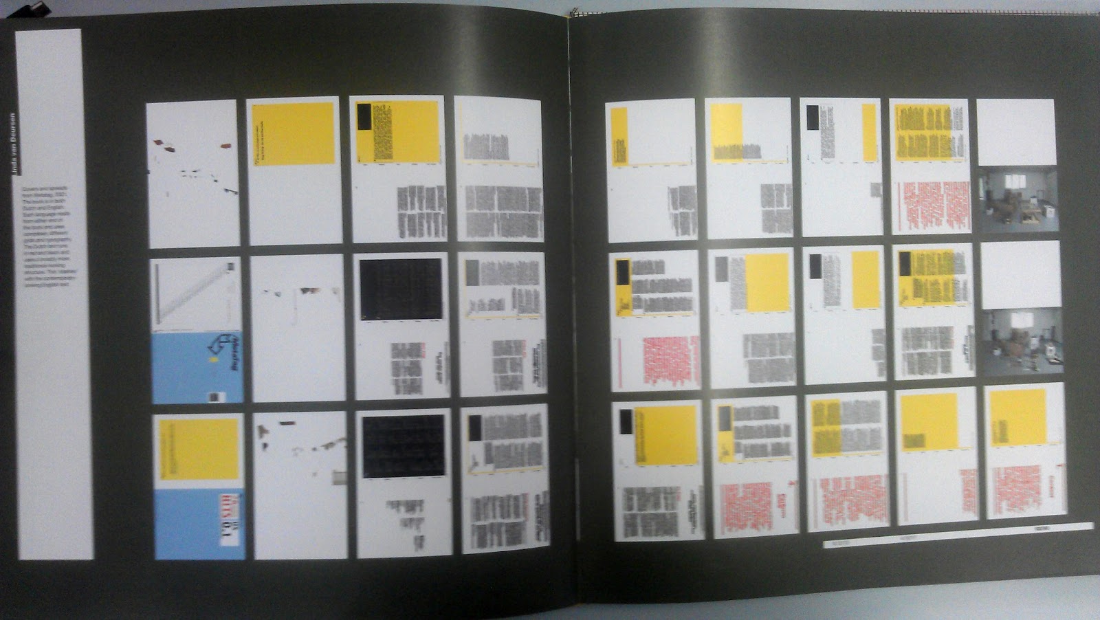
Above- examples of image and type with a 20 grid field and a larger right margin. The gutters create a white area that has an importance of structure and separation of information and ease of reading and understanding. 


Here, the same grid system is applied to show different ways of presenting type and image. Notice the amount of variation possible with one grid system of 20 modules. 


Photographs must be constructed with the grid in mind so that they work with consistency and so that they look like they are part of the grid system. Brockmann suggests that the photograph should be constructed with a mental image of where it is going to be placed and the containing area of grid that it will be placed into. 

I have loved this musica viva poster ever since I saw it first. I think the asymmetric layout is so strong and the composition is so pleasing on the eye. Here, he explains how it was created. It is a grid 4 and a half fields wide and 4 fields deep. Musica is set with irregular kerning so that a rhythm is created. The lines of the type of information at the bottom align with the text of the viva and musica. It creates a sense of "sever but elegant architecture."


Monday, 18 March 2013

The designer and the grid


I am going to thoroughly read this book and document in note form anything that I find particularly useful and will help me with my understanding of grids and creating systems. 

The page before the information shows the grid that has been used to create the book and every page that is in the book.


 It shows how much diversity that you can have within a more complex grid structure whist maintaining the grid boundaries. Overlay areas of the grid systems that I use when I print my final layout ideas would look effective, perhaps the overlay would look nice either as a fine line like here, or as blocks of varnish.
I like the problem statement in the introduction of the book- "a chaotic world in which parameters are always changing; a need for control without being controlled; a desire to find beauty and truth; vast quantities of words and images that need to be placed on the page..."

-A grid has been made impossible to completely break when working digitally because of the pixel.

A grid is essentially a series of vertical and horizontal lines. The vertical lines represent the column width, and the horizontal lines determine the space that that module of text/information will occupy. Column widths should be determined by the point size of the text that is being used, so the point size of text needs to be specified on a stylesheet for the stylesheet to be successful. Width of columns should also be affected by how many words per line are displayed in order to get aesthetic balance and also ease of reading. You can also rotate the grid structure, columns do not have to be vertical, and the same rules apply. insert the image of simple grids I read in another book that generally, for aesthetic balance and to draw your eye inwards at the information, the margin of the document should be at least double the width of the gutter of the grid.


Grids are practical for producing multiple paged documents because you have a system to work to. You get a strong visual consistancy, a consistancy that works. Designers are forced to think about the minute details of the design. They bring order to a page and unite aesthetic with practicallity.

An aesemetric grid- Joining columns to create text boxes are different from left side of the document ot the right side. The grid was designed with aesymetry in mind. It allows you to think more broardly about the potential of the layout of a page.

The baseline grid- is a series of horizontal lines across the page, and each line represents the potential baseline for a line of type. "(Baseline is the line that the bottom of capital letters sit)". This is known as leading. For my layouts, it is important for me to show leading of the type that will be used. The document that I produce will show this. To give greater flexability, the leading is usually smaller in point size than the height of the baseline to baseline of the type size. For instance, if the baseline to baseline is 9points in size, then a baseline grid would be sufficient to be every 3 points. Then this system is used to develop a higherarchical spacing system. For instance, 6 points gap between headers and main text, 12 point font for headers etc...Note, consider where you will be setting up the type before setting up the baseline grid.


vertical layout- columns. Horizontally- baseline grid and top and bottom margins. also, page can be divided into horizontal areas called fields. long lines of text can be difficult for the reader to read. smallest column- measurable in whole or half millimeters makes it easier. space between columns- generally 4 or 5 mm to make the whole system easier to add up and for the grid to be created. You can create a grid that is made with two or more grids placed on top of each other. may give unusual spacing for captions etc, harder to work with.

If the grid is made with small columns, one or two can be left blank deliberately to give a larger margin, aiding aesemetric layout on the page.


You can also use the grid and fields to align text horizontally for titles etc, gives the page more dynamism and interest.


Extremes in layout make pages more dynamic and more visually interesting, so experiment with extremes in layout when I have constructed my grid.

A nice idea would be to design a bookshelf in the style of my grid that would display the books for the typographic workshop, or the structure that the books should be layed out on the table. The size of book and positioning would matter heavily. (Areas could be mapped out with small pieces of masking tape for instance to get the layout of the books on the table. Units of furniture become one and easily stored- this is all done with grids.This design is with grids.


The starting point to designing a grid is the text- its meaning and the hierarchical devices it requires. Look at the information, then work out how the form can be broken down into it.


The above two images are examples of Wim crouwels work. He strictly utalises the grid to create not only his typographic layout but also the type itself. I want to experiment with this idea for my TW typography  Perhaps I could create a system where everything including the type is derived from the grid that is used to construct the document?


Relationship of the font and the grid is extremely important and differs for every font. Univers 55 is the most neutral of fonts. Then amend your weight and tone for hierarchy. Be expressive with the composition over the type.

Even if the font changes, the baseline grid should be the same throughout. This will maintain control over spacing between paragraphs. The x-height can also be considered in alignment  though the baseline is standard for optimum text alignment.

The system needs to accomodate the audience, what sort of text and images illustrate it, where it will be read, in what way the text is subdivided, and other typographic devices such as running heads, quotes, captions, lists, tables, contact details, footnotes or anything else that will interrupt the straight running of text.

To determine a grid, Muller Brockman suggests that the optimum number of words for a line is 7. Use this when designing my grid initially and to determine the column width. Providing an odd number of columns aids the asymmetric layout of the production. Narrowest column- may be used to give captions, address details, multiples of this unit might work as standard text boxes.


Paper size determines printing size, and so you must use your grid economically and also your paper source economically. Standardization of paper size results in a system that can  be applied to anything and is the most economical way of production. Therefore, why produce a document that is a different size or format just for the sake of it?

Try having the intercolumn gaps or the gutter as one linespace as this will be further than paragraph to paragraph spacing.


Grid systems by muller brockman-

printed matter is normally read at 30cm-35cm distance away. Therefore you should design your work with this in mind.

The corporate identity is a big project to tackle. This is because you have to plan for information that has not maybe even been thought of yet. You need to create a sense of tension and innovation. In the words of brockmann it requires a very high order of intelligence, knowledge, ability and imagination on the part of the designer.

titles of the same size and in the same position on all of the pages must be used throughout
subtitles of the same size and position always are the same distance from text around it
captions are the same size and illustrate the illustration around it in the same format and way
the same grid is used for text and pictures on all pages
photos reflect the same typographic style throughout
statistical information should be displayed in the same way throughout
leading to be constant throughout for the same size of type


Thursday, 14 March 2013

The Brief

I had a masterclass in typography with my tutor Anthony Head. During this masterclass we had to come up with a corporate identity that included not only the logo but also all the style sheets, colour scheme and complete visual package. Obviously there was not enough time in the day to complete this task in full, but I was really inspired by the project and so I wish to take it further. I want to create a visual identity for the university to create masterclasses for typography, but also for specialist skills such as photography or screen printing. Ultimately, the style sheets and consistent corporate identity that I will create will be able to be used by another designer to put the information documents or posters or whatever method they choose to convey the masterclass information in a visually consistent and styalised manor. I will have specific pantones chosen for the colour scheme of the identity and create systems for the photography and text placement on all documents. My main focus initially will be upon the typography masterclass. I think it is really useful to have an identity focusing on typography for a typography masterclass, the document will be for designers and so I can be more experimental in my approach to the typography and layout. I want to create some sort of visual pun or a play on typographic structure and the grid. SO, my research is going to start with looking at the grid system. I want to learn all of the applications for creating the grid. I also want to learn how you can break the grid aesthetically. Also, I want to research corporate identity and the most successful corporate identity projects.