This is my logo development. Because the typography workshop is advertising typography to typographers, I want to create a logo and ultimately a system that a typographer will understand and get instantly, but somebody that does not study design does not understand. My research focuses on the importance of grids, so this is where my idea has origonated. I am experimenting with ways in which I can use the grid to come up with a typography workshop logo. The ideas use both the grid modules and the gutter. The grid is constructed with a consistant gutter width and modules that are square in shape.

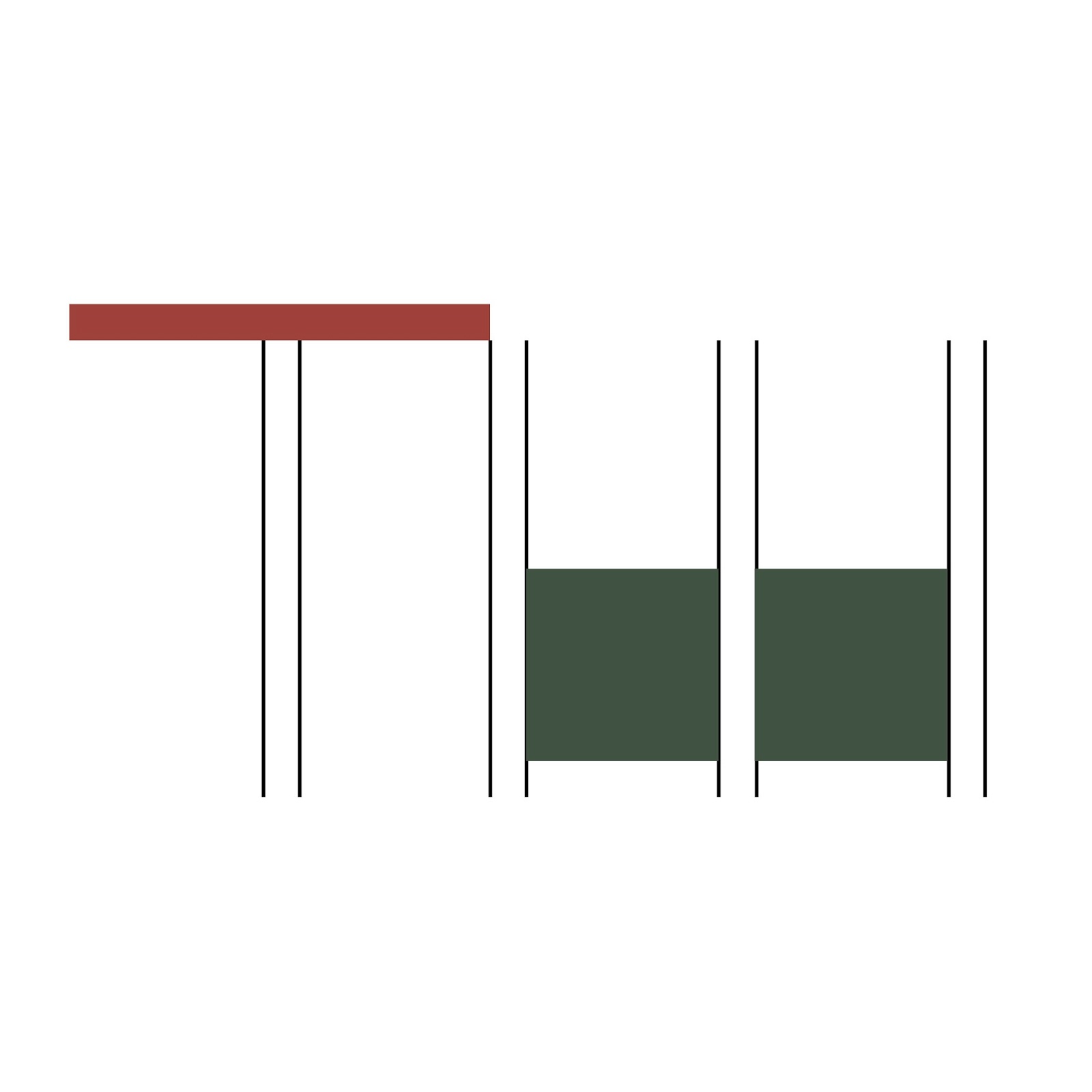
The example above demonstrates this. This idea used the gutter for the down strokes of the t and the w, and the modules for the suggestion of the lower area of the w. I quite like showing only a suggestion of the 'TW'. I am trying to appeal to designers.


I think that this idea is quite effective as the logotype is very simple and it is clear to the viewer that I am using a grid to construct it. However, the w is looking more like another t. I want to work on this idea, but I definitely prefer a simpler design that focuses on balance.


The logo attempt above is too condensed as a font, but I like the fact that I am trying to further simplify the type and only using the gutter of the grid for the creation of the letterforms.


These logos are far too complicated. I have tried to bring in all of the colours of the typography workshop that I have chosen and will define in the next post. I want a simpler logotype that uses minimal components for its construction but is still legible as the two letters tw.

This idea is definately getting somewhere. I like the idea of only using the gutter to create the logo. It is simple but effective. I am going to try these as upper case characters. My choice of typeface is helvetica. Helvetica is a well structured, well balanced typeface that is widely used and recognised as one of the great typefaces. Therefore it is fitting to use this in my Typography Workshop design.

This is my final logotype design that I am happy with. It uses only the gutter that surrounds the modules of the grid. All of the components are exactly the same size as the grid was constructed to create perfect squares. I am really happy with this logo. I think that it is well balanced and also very simple in its construction.
No comments:
Post a Comment