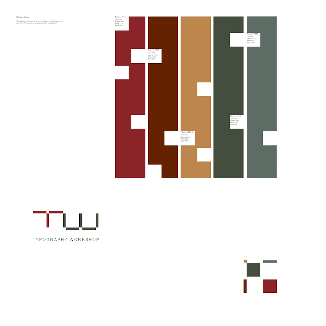
This is the colour scheme that I am outlining for typography workshop design. It consists of five colours. I was in the letterpress room and though that it would be fitting to lift my colour scheme for the typography workshop directly from this area. The colours were found on the machinery and presses, on tables and on the type itself. I feel the five colours compliment each other and work well together. They are all muted colours, but this will heighten a sense of sophistication in my typography workshop design.
The five panones are:
447 M
445 M
4645 M
490 M
506 M
I have chose matt pantones because I feel that again, a matt colour will add sophistication to design.

No comments:
Post a Comment